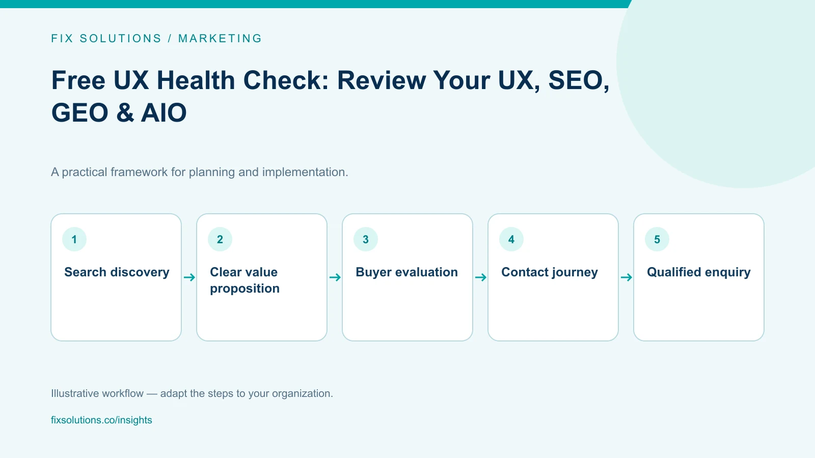
A UX Health Check reviews how effectively your website helps visitors understand your offer, find relevant information and complete an important action. FIX Solutions connects this usability review with SEO, GEO and AIO checks to identify obstacles across the customer journey—from search discovery to a consultation request.
Key takeaways: A website can look professional and still make purchasing decisions difficult. Review usability and search visibility together, while recognising that they measure different things. Useful recommendations identify the affected page, the business consequence and the next action. AI search readiness is not a certification or a guarantee of inclusion in AI-generated answers.
Why Does Your Website Attract Visitors but Generate Few Enquiries?
Your marketing team reports traffic. Your sales team asks for better leads. Your website presents the company professionally, but qualified prospects still leave without making contact.
The problem may not be a lack of promotion. It may be the work your website expects visitors to do.
A prospective customer might need to open several pages to understand your services. A procurement manager might struggle to find implementation details. A mobile visitor might abandon a form that asks for information they are not ready to share.
These are different problems with a common consequence: the website adds friction to a commercial decision.
Before investing in another campaign or a complete redesign, examine the journey already in place:
- Can the right buyer find the relevant page?
- Does the page answer their actual question?
- Is the offer specific enough to evaluate?
- Does the next action match their stage of consideration?
- Can they complete that action without confusion?
A UX Health Check provides a structured starting point for answering those questions.
What Is a UX Health Check?
A UX Health Check is a focused assessment of a website’s usability, information structure and key customer journeys.
It examines whether people can understand the content, navigate between relevant pages and complete tasks such as requesting a proposal, booking a consultation or exploring a product.
It is not simply a visual design review. Colours, spacing and typography matter, but they are assessed in relation to comprehension and task completion.
For example, a large “Contact Us” button may be easy to see. However, if the page never explains who the service is for or what happens after contacting the company, the button alone does not resolve the buyer’s uncertainty.
A useful review distinguishes between:
- Observed issues: a broken link, overlapping text or missing form label.
- Potential friction: unclear wording or a demanding enquiry form.
- Questions requiring evidence: whether a particular step causes abandonment.
That distinction prevents assumptions from being presented as proven causes of lost revenue.
What Does the FIX Solutions UX Health Check Examine?
Our review approach connects the website’s presentation with the decisions customers need to make.
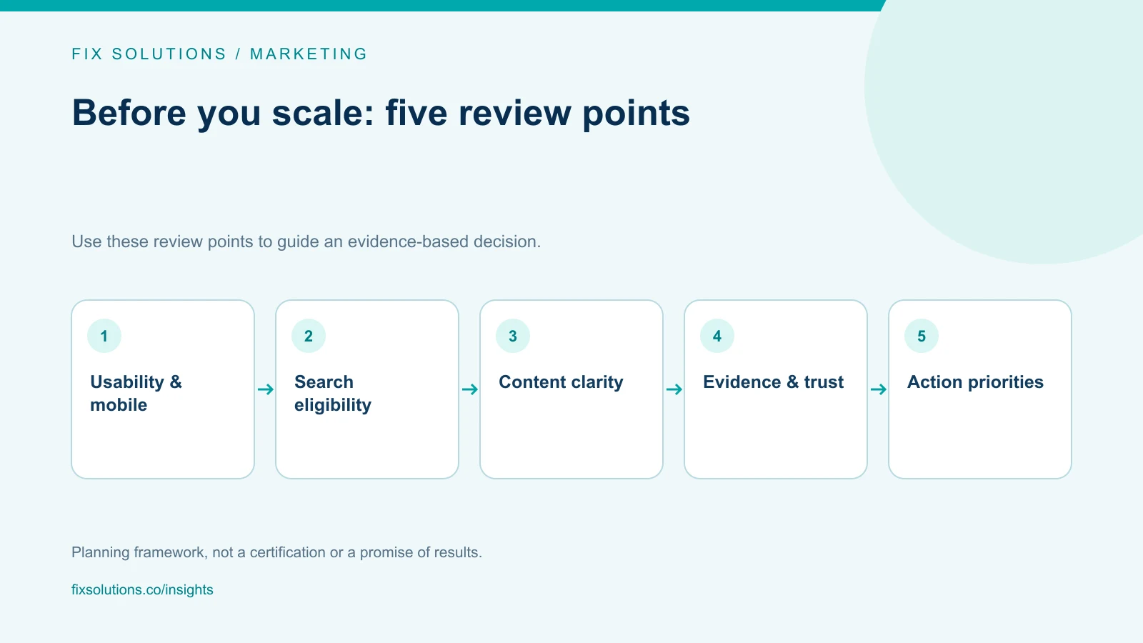
1. Value Proposition and First-Screen Clarity
The first screen should establish what you provide, who it is for and why the visitor should continue.
We examine whether headings communicate a concrete offer or rely on broad claims that could describe almost any business.
For a B2B service page, useful information might include the operational problem addressed, the delivery scope and the type of organisation served.
The objective is clarity—not adding more text above the fold.
2. Navigation and Information Architecture
Visitors should not need to understand your internal company structure to find a solution.
We review menu labels, service groupings, product categories and internal links. We also look for overlapping pages that make similar promises without explaining their differences.
For example, “AI Consulting” and “AI Development” can both be valid services. Their pages should clarify where advisory work ends, where implementation begins and how a customer moves between them.
3. Mobile Usability and Readability
A desktop layout can hide problems that become obvious on a phone.
The review considers text size, contrast, menu behaviour, horizontal overflow, button placement and whether fixed interface elements obstruct important content.
Images and decorative effects should support the message rather than compete with it. A customer should be able to read a service explanation and reach the next action without repeatedly zooming or dismissing overlays.
4. Contact Forms and Conversion Paths
An enquiry form is part of the customer experience, not just a technical component.
We examine the number of fields, required information, instructions, validation messages and confirmation wording.
A form asking for budget, timeline and detailed requirements may be appropriate for a proposal request. The same form may be unnecessarily demanding for someone seeking an initial conversation.
A visible success message also deserves scrutiny: it should correspond to a successfully processed submission, not merely a button click. End-to-end delivery testing requires an agreed test and access to the relevant systems.
5. Trust and Decision Support
Enterprise buyers often need to justify their shortlist internally.
We assess whether the site provides relevant company information, service scope, delivery explanations and evidence that supports its claims.
Useful proof might include an attributable case study, a clear implementation process or a named team member’s relevant expertise. Unsupported metrics and generic testimonials are not substitutes for evidence.
How Do UX, SEO, GEO and AIO Fit Together?
These disciplines address related but distinct questions.
| Review area | Core question | Example checks |
|---|---|---|
| UX | Can visitors understand and use the website? | Navigation, readability, forms and task completion |
| SEO | Can search engines access and interpret relevant pages? | Indexability, titles, internal links and content relevance |
| GEO | Is the content clear and credible enough to serve as a useful source in generative search? | Specific explanations, supporting evidence and consistent company information |
| AIO | Does the content address questions relevant to AI-assisted search experiences? | Direct answers, contextual detail and technical eligibility |
In this article, AIO refers to optimisation for AI-assisted search experiences, including Google AI Overviews. GEO and AIO are industry terms with overlapping uses—not universal certification standards.
Google states that its existing SEO fundamentals remain relevant to AI Overviews and AI Mode. It does not require a separate AI-specific schema or special AI text file for inclusion. Pages must meet the relevant search eligibility requirements, and inclusion is not guaranteed. Google Search Central
For businesses, the practical implication is straightforward: fix the foundations before purchasing promises of guaranteed AI visibility.
What SEO Issues Can Undermine an Otherwise Good Website?
A well-designed page cannot fulfil its acquisition role if search engines cannot access or index it as intended.
A preliminary SEO review can examine:
- Whether important pages return successful responses.
- Whether indexing directives appear to conflict with the page’s purpose.
- Whether canonical URLs identify the intended page.
- Whether titles and headings describe distinct offers.
- Whether internal links connect services, products and supporting articles.
- Whether important explanations are available as readable text.
Public checks have limits. For example, confirming how Google has indexed a particular URL may require access to Search Console.
We distinguish between what the website exposes publicly and what needs account-level investigation. A public-page review should not claim to have verified private search performance data.
FIX Solutions can connect these findings with marketing services and, where implementation is necessary, IT development support.
What Makes Content More Useful for AI-Assisted Search?
Start with the questions a customer needs answered, rather than the phrases a business wants repeated.
Consider a page that says:
“We deliver innovative solutions for digital success.”
It provides little detail about the service, its application or the evidence behind it.
A more useful explanation would identify the problem, the delivery approach and the relevant constraints:
“We connect customer records across sales and service systems so teams can work from a shared account history. Integration scope depends on the existing applications, data quality and access permissions.”
The second statement gives both customers and information-retrieval systems more context.
A GEO/AIO-oriented content review therefore looks for:
- Clear definitions of services and products.
- Answers to real evaluation questions.
- Distinctions between similar solutions.
- Evidence supporting quantitative claims.
- Relevant authorship or review information.
- Consistent company and contact details.
- Explicit limitations, dependencies and implementation conditions.
Making content easier to interpret does not guarantee that an AI platform will cite it. It does, however, make the website more useful to the people evaluating your business.
What Does an Actionable Finding Look Like?
A list of warnings is not the same as an improvement plan.
Each recommendation should explain the issue, the evidence, the likely consequence and the next step.
| Finding | Potential consequence | Recommended next step |
|---|---|---|
| A mobile menu covers the enquiry button | Visitors may struggle to reach the contact path | Adjust menu behaviour and retest on smaller screens |
| Two service pages use nearly identical explanations | Buyers may not understand which service they need | Clarify scope, deliverables and cross-links |
| A form shows a generic error without guidance | Visitors may not know how to recover | Add specific validation and a usable alternative contact method |
| A case study makes an unsupported performance claim | Buyers cannot evaluate the evidence | Add the measurement context or remove the claim |
These are illustrative examples, not findings from your website.
Prioritisation should consider the severity of the issue, the importance of the affected journey and the effort needed to resolve it. A broken enquiry form generally deserves attention before a minor decorative inconsistency.
How Does the Free UX Health Check Work?
Step 1: Share Your Website and Business Objective
Send your website URL and explain what a successful visit should produce.
That might be a consultation request, a product demonstration, a qualified sales enquiry or a clearer understanding of your services.
Include your main concern: low enquiries, confusing navigation, weak mobile usability or uncertainty about search visibility.
Step 2: Confirm the Initial Review Scope
The initial review should focus on an agreed page or journey rather than imply that every part of a large website has been audited.
A sensible starting point is the homepage, a priority service page and its contact path.
No production credentials are needed to request a public-page assessment. If deeper analysis requires analytics or Search Console access, permissions can be discussed separately.
Step 3: Identify Priorities and Next Actions
The aim is to separate immediate problems from improvements that require further evidence.
Some findings may be resolved through copy or layout changes. Others may require technical work, measurement or user research.
The free check is an initial diagnostic—not a complete accessibility certification, security assessment, moderated usability study or implementation engagement.
Step 4: Decide What to Implement
A review only creates operational value when its recommendations can be acted on.
Your internal team can use the findings to plan changes. If you need support, FIX Solutions can discuss a defined implementation scope covering content, interface changes, development and verification.
Testing can be coordinated through our quality engineering services, with responsibilities and acceptance criteria agreed before work begins.
You can also meet the FIX Solutions team to understand the technical and commercial disciplines involved in delivery.
Frequently Asked Questions
Is a UX Health Check the Same as an SEO Audit?
No. A UX Health Check focuses on how people understand and use a website. An SEO audit focuses on search-related accessibility, relevance and technical conditions. Reviewing both helps identify problems across discovery and conversion, but neither replaces the other.
Can a UX Health Check Guarantee More Leads or AI Search Citations?
No. Lead generation depends on factors including offer quality, audience fit, traffic sources and sales follow-up. AI citations depend on the platform and query. A review identifies issues and improvement opportunities; it should not promise a specific commercial or search outcome.
Do I Need to Redesign My Entire Website?
Not necessarily. The first priority may be a clearer headline, a better service explanation, fewer form fields or a corrected technical setting. A redesign should follow evidence that the existing structure cannot support the required customer journey.
Request Your Free UX Health Check
Before spending more to attract visitors, check whether your website gives them a clear reason—and a practical way—to take the next step.
FIX Solutions brings together usability review, SEO foundations and GEO/AIO readiness to help you identify what needs attention first.
Share your website URL, your main business objective and the page or journey you want reviewed.
Request a Free UX Health Check
In your message, include “UX Health Check” so we can understand the purpose of your enquiry.